Whether it is past design movements or the emotional pull of an event itself, letting inspiration guide the design provides for print and digital media that stands out and gets noticed. Below are works created for performing arts and interfaith organizations that gave me a lot of subject matter from which to be inspired.
Visit the branding, video design, and photo manipulation sections of my portfolio for a more complete picture of my skills.
Print and Digital Media for Performing Arts
The performing arts provides so much richness when it comes to inspiring print and digital media. Focusing on the theme for the concerts being performed, I have found that researching past design movements and current trends and even current events provides a wealth of inspiration. Below are examples of work I have done for two different choral groups, Harmonia Atlanta and Venice Chorale. While both community choruses, they have very different philosophies as to how they fit into their communities.
Harmonia Atlanta: Concerts with Compassion
Harmonia Atlanta initially hired me to help them do a complete rebranding. Their mission is to not just provide entertainment with their choral music, but to use it as a vehicle for compassion, promoting nonprofit organizations in the Atlanta Metro Area that tie in with the theme of a particular concert. I now provide print and digital media to promote their concerts. Below are two examples.
Music Feeds the Soul: AI artwork and Photoshop provide creative space for inspiration
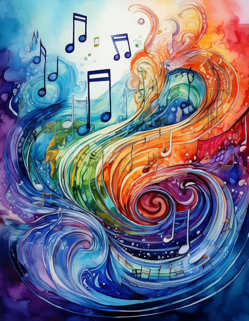
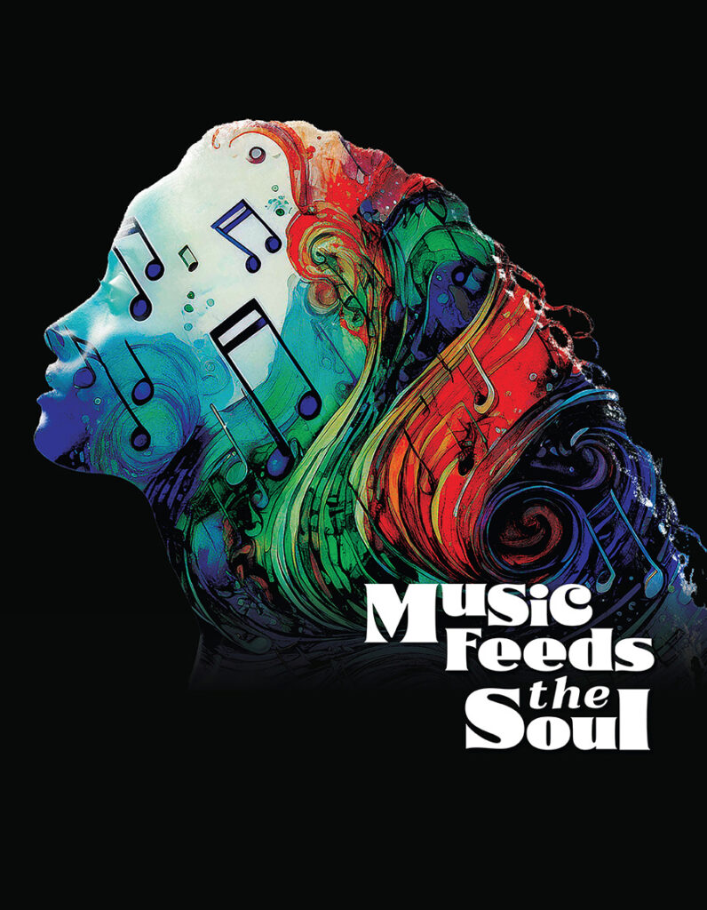
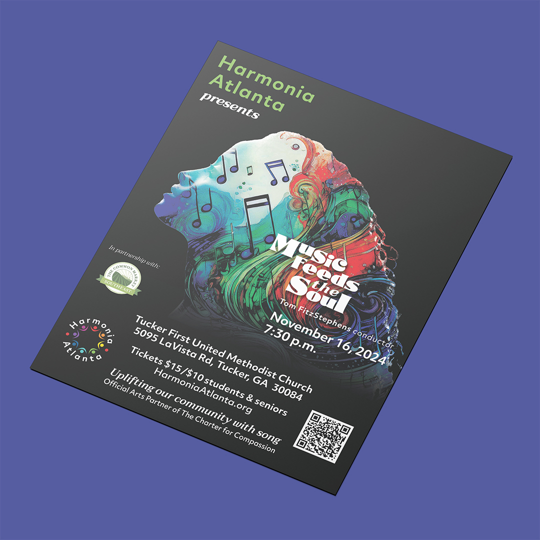
This concert was described to me thusly: “Like food and water, we also need personal expression to live a full life. This concert is about the fulfillment music gives us, how it feeds our souls, and also about how beautiful it is to feed others.” As an experiment, I decided to see if AI created artwork could be used in the design for the graphics of this concert. The vision was to overlay water color style artwork over the profile of a person to denote music feeding the soul.
The prompt used for the artwork was “colorful abstract water color painting of musical notes intertwined with flowing water and food purple red green blue”. The image chosen to be used for the graphics for the concert is below. The resulting graphics for the concert came together beautifully when the profile of a woman with long flowing hair was used as the subject for the composite. The typeface was chosen for its bold but very warm, human feel that heralds back to the psychedelic movement. The nonprofit partner for this concert is The Common Market Southeast.
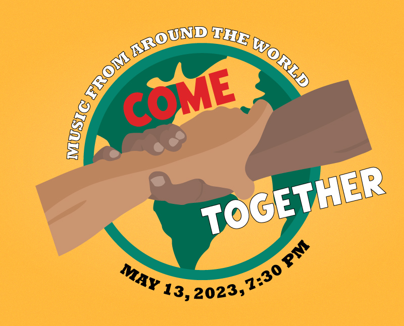
Come Together: Building community WPA style
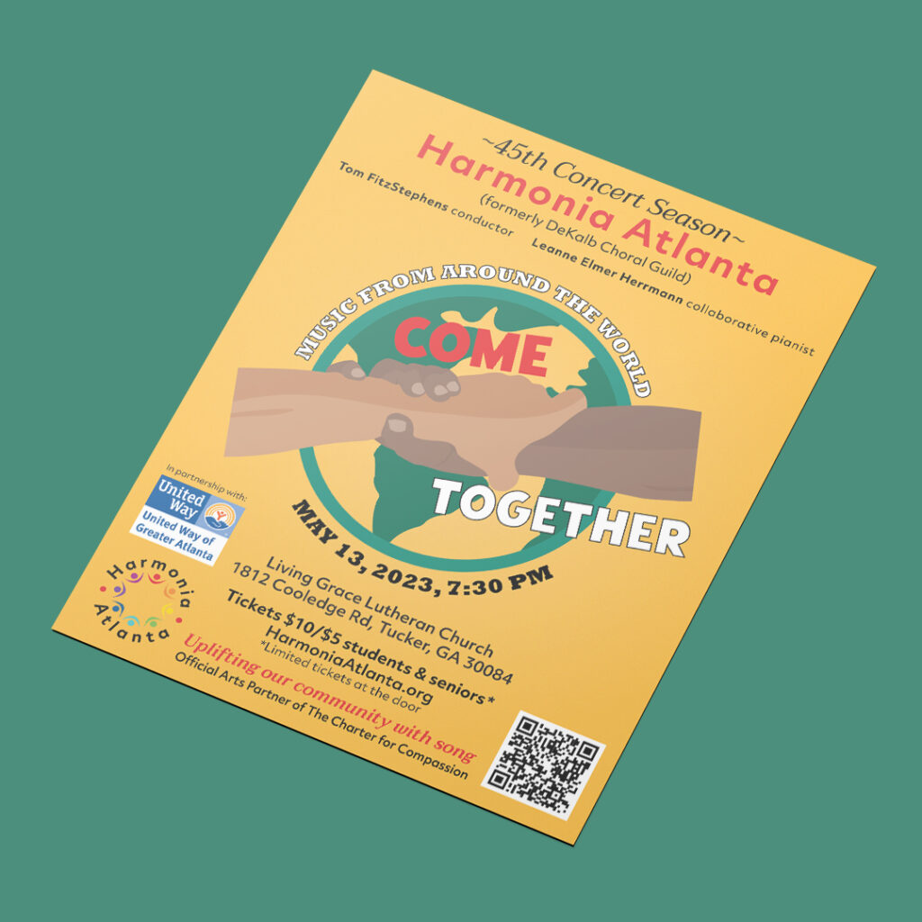
One of the focuses of design in the WPA era was the idea of community building through the arts and labor. When approached by Harmonia Atlanta to do their graphics for a concert that was all about building community through song, particularly using choral music from around the world, using the WPA style seemed appropriate. United Way of Greater Atlanta was the nonprofit promoted during this concert.
Venice Chorale: Pushing the Envelope
When I did work for The Venice Chorale, the music director at that time was looking to really push the envelope when it came to choral music. The community itself is rather conservative politically, which inspired the artistic director to use music as a vehicle for change. I fully enjoyed exploring how I could use graphic design to reflect his vision. For the most part, the pieces I did was for print, either for posters or newspaper advertising, as the local population relied on print publications instead of the internet to keep track of what was going on in the community.
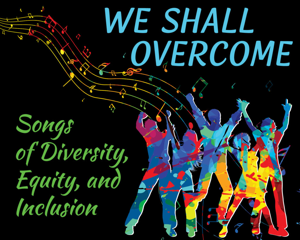
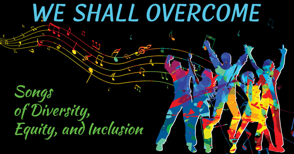
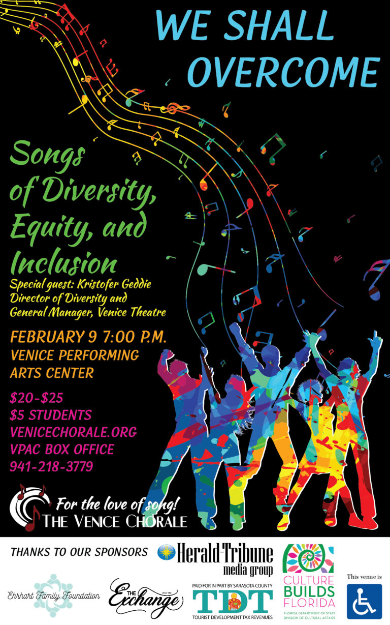
We Shall Overcome: An outright political statement and the last concert before COVID
We Shall Overcome was a concert that celebrated diversity and memorialized the adversity that racial minorities and the LGBQIA community have endured in the United States. In a community as conservative as Venice, FL, this was a bold undertaking. The graphics went through a few versions before the final was settled upon. The first two were deemed too controversial by the new Executive Director. However, the end result still gained public attention, both in praise and in derision. This was, unfortunately, my last work that I did for Venice Chorale. With COVID, the organization had to cancel the rest of their season and did not start back up again until after I moved to Atlanta.
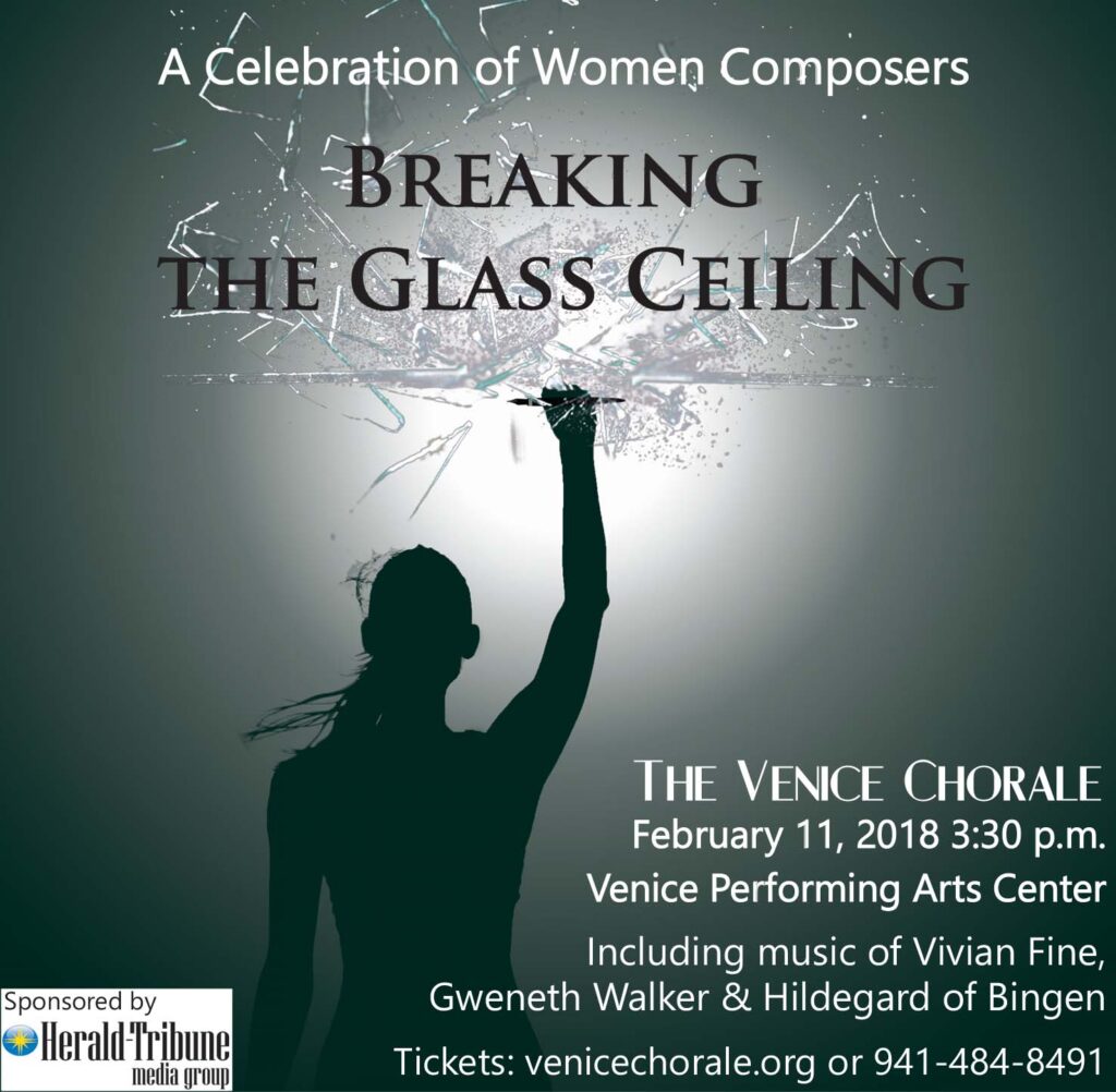
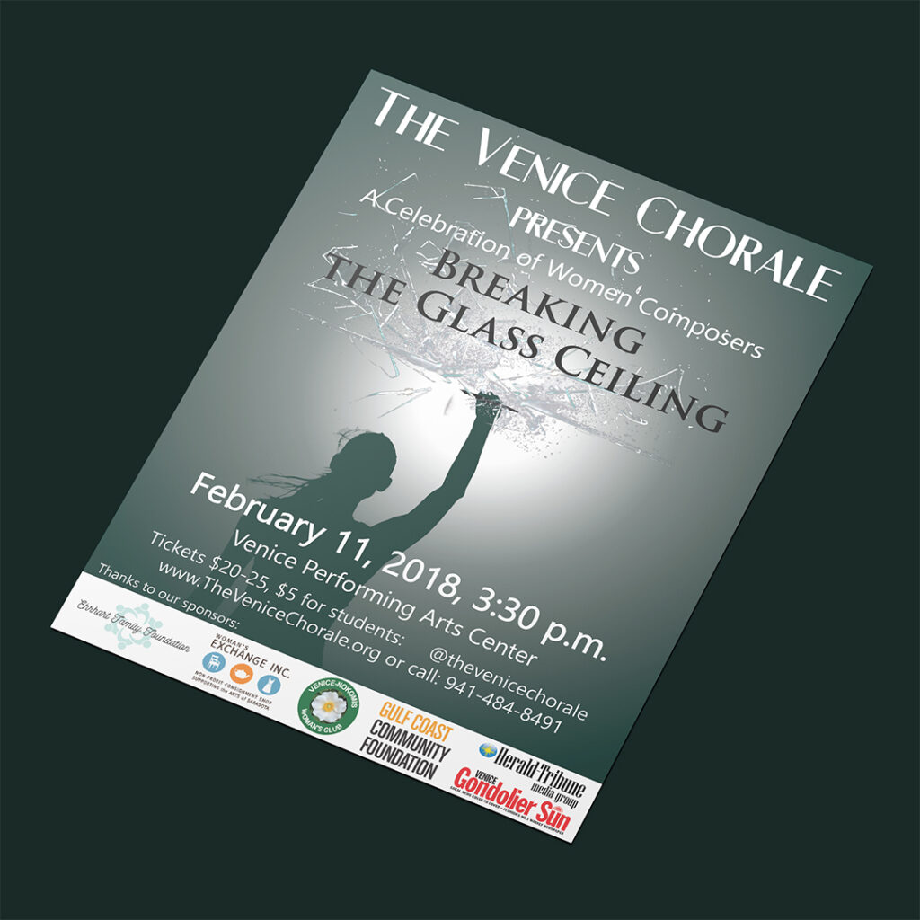
Breaking the Glass Ceiling: A musical tribute to Hillary Clinton
Without ever mentioning her name to the powers that be, the music director made a decision to put together a concert as a tribute to Hillary Clinton after she lost the 2016 election. The artwork I put together is quite literal, and as one of the board members pointed out, gained the attention of people in the community. Some understood the intent behind the concert as soon as they saw the artwork, others pointedly ignored the symbolism when they realized the artwork was promoting a concert comprised of female composers and were relieved that it wasn’t something more sinister like “feminism”.
Life and Landscape: A concert created to push the boundaries of traditional choral music
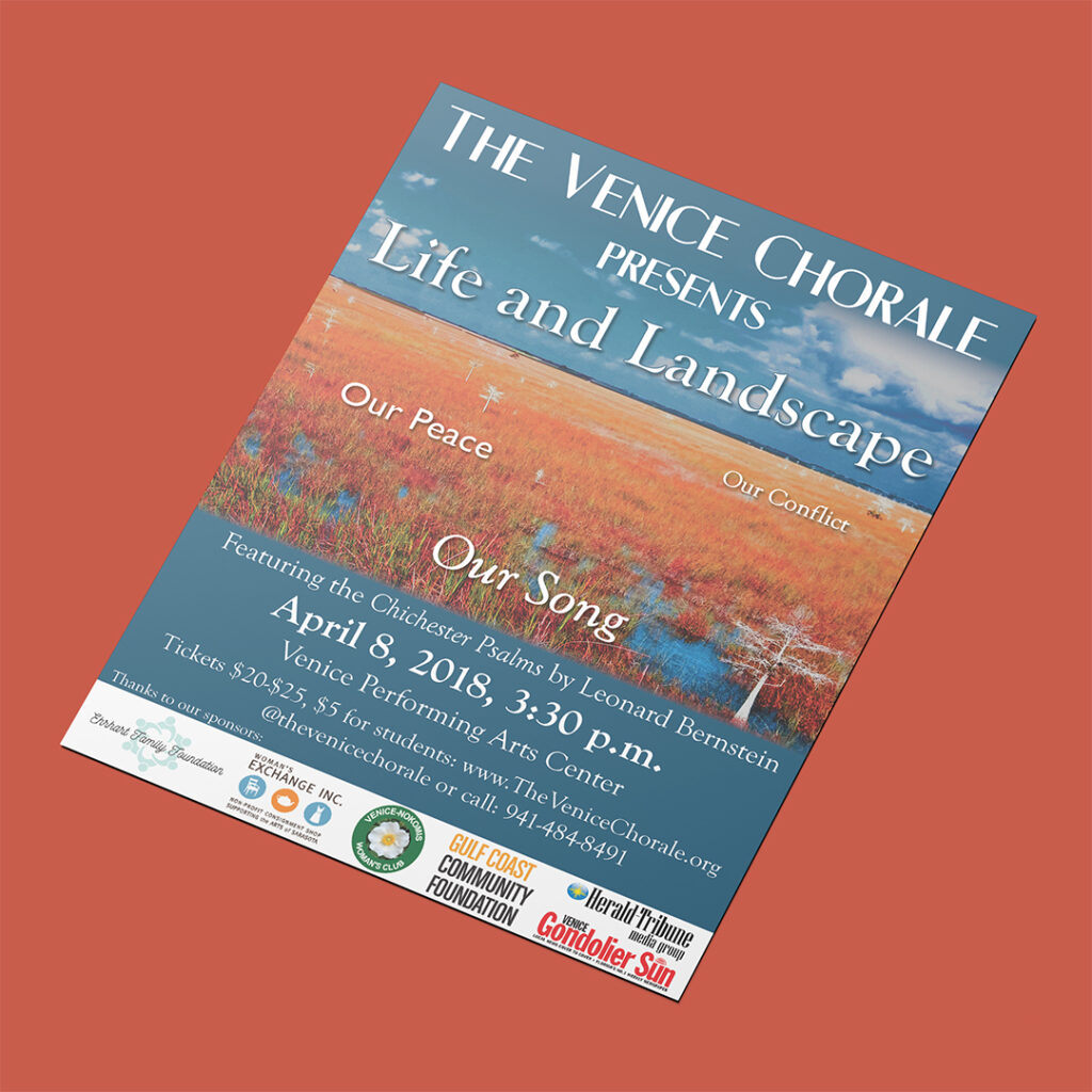
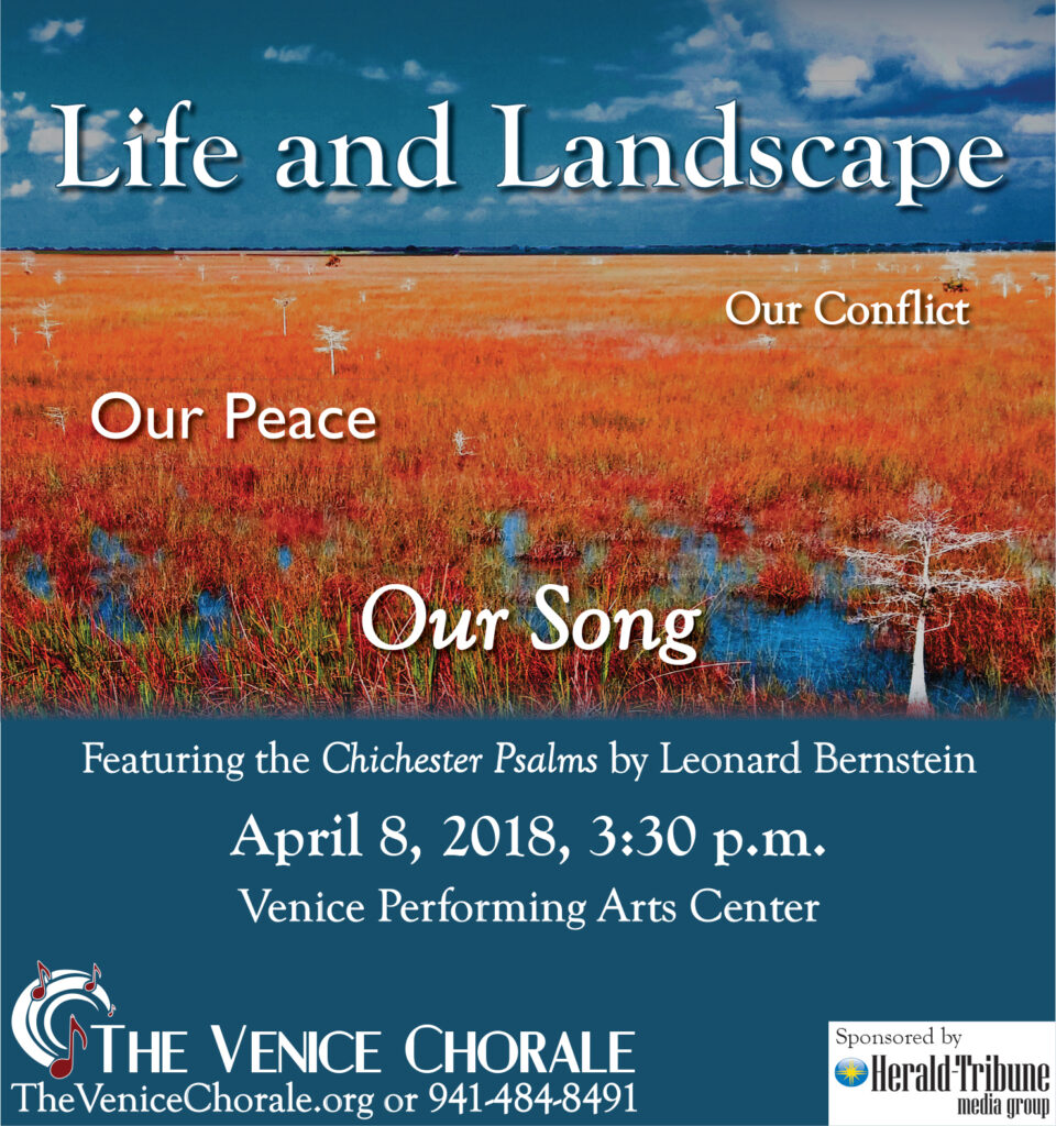
This concert not only featured the Chichester Psalms by Leonard Bernstein, but also choral pieces by composers like Ola Gjeilo, that push the boundaries of traditional choral music. Venice Chorale’s music director was intent on getting the Venice community to widen their cultural horizons.
When putting together the artwork for this concert, I decided to use a photograph I took of the Florida Everglades that I had manipulated in a manner that took it out of the world of reality and into the world of fantastical. It provided the perfect backdrop for the promotional materials for this concert.
Print and Digital Media for Social Justice
I worked in social justice for much of my adult life either as an employee or a volunteer. I have used my experience when creating print and digital media for nonprofit organizations who wish to promote stronger communities through social justice.
One example is the work I did for the annual Winter Series given my Venice Interfaith Community Association, which was an anticipated event in their community. The organization took on difficult subjects such as racism and interfaith and secular polarization, all in an effort to foster respect, understanding, and cooperation among disparate groups in their community. Below are examples of print and digital media designed for their Winter Series.
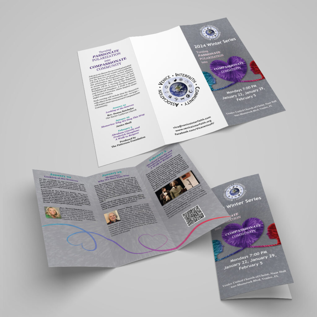
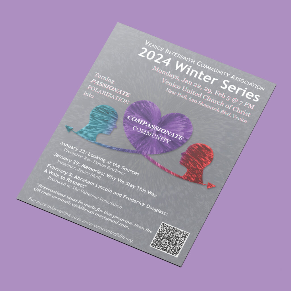
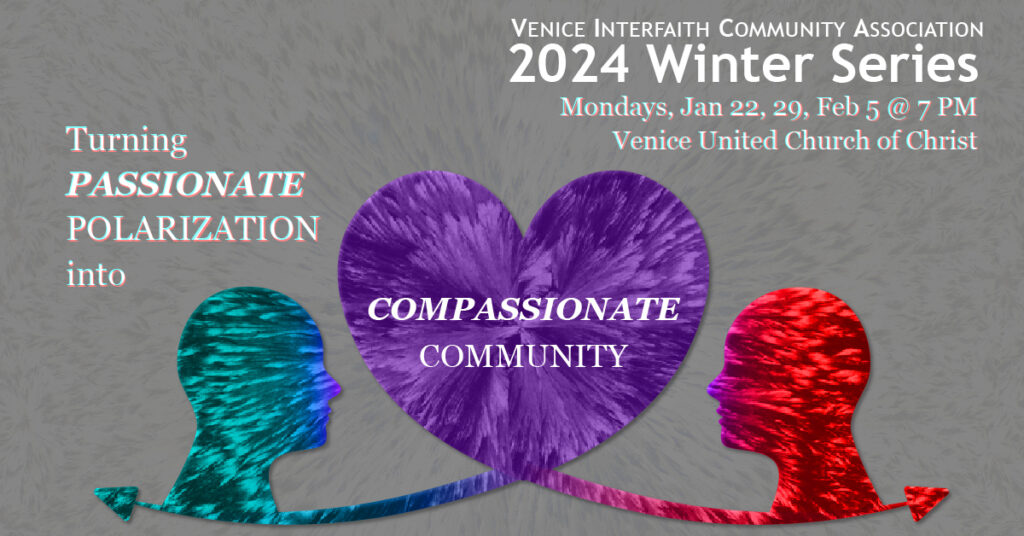
Turning Passionate Polarization into Compassionate Community (2024 Winter Series)
The 2024 Venice Interfaith Community Association Winter Series was focused on finding the root of society’s polarization in both sacred texts and secular memory and discussing ways to build common ground toward a Compassionate Community.
The print and digital media for this series came together using the idea of polarization in the technical sense, using an image of polarized crystals as the basis for the design, and using colors that people would recognize in American Society as depicting political polarization. However, the main point of this Winter Series was building a Compassionate Community, which means there needed to be a way to meld those colors together and create a graphical representation for compassion that could be easily identified.
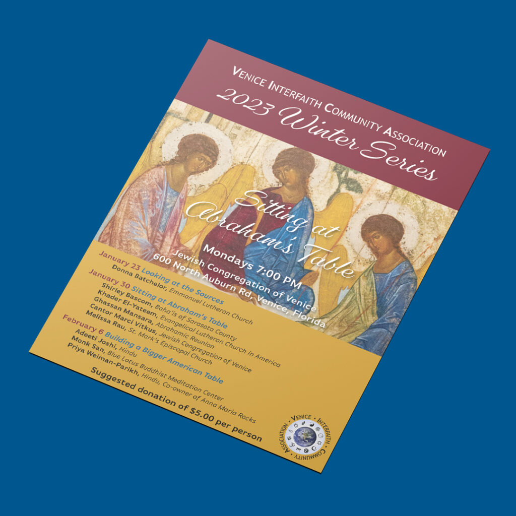
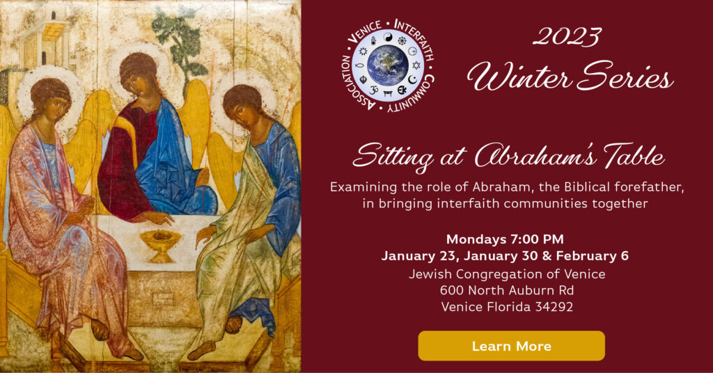
Sitting at Abraham's Table (2023 Winter Series)
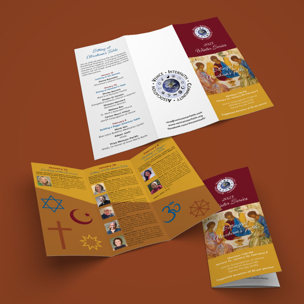
This Winter Series centered around the story of Abraham’s hospitality and how that might be used to build bridges among the Abrahamic faiths and beyond. An iconic image that tells this story was used as the center piece of the print and digital media created for this series. Lifting the colors from that image to create the color palette worked very well.
American Racism Parts I & II (2019 & 2020 Winter Series)
Two years and twelve programs long, this set of Winter Series was an ambitious undertaking by Venice Interfaith. The series addressed extremely difficult subject matter, especially for a community that is 98% white. It was an honor to be involved in this endeavor.
Racism is as American as Apple Pie, and has been here since Europeans landed on the shores of this continent. To create the print and digital media, old fashioned stamp lettering was used to denote the long history of racism, with the colors red, white, blue, and black to enforce the fact that this is an American issue, and that this series is about racism against Black Americans by white Americans.