Branding is all about telling a story through words and imagery. A nonprofit’s mission or a business’s vision and their target market is only the beginning. Delving into the background of the industry, the definition and etymology of words, and the story behind the mission or vision provide opportunities to create a brand that is unique, creative and full of meaning.
Below are branding projects that include client work and classwork from Sessions College for Professional Design and California Institute of the Arts.
For more, please see my print and digital media, video, and photo manipulation work.
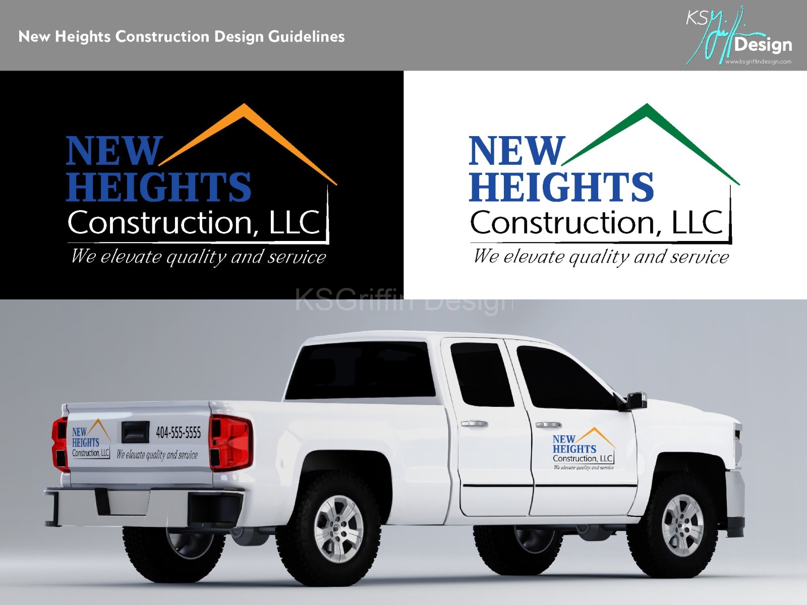
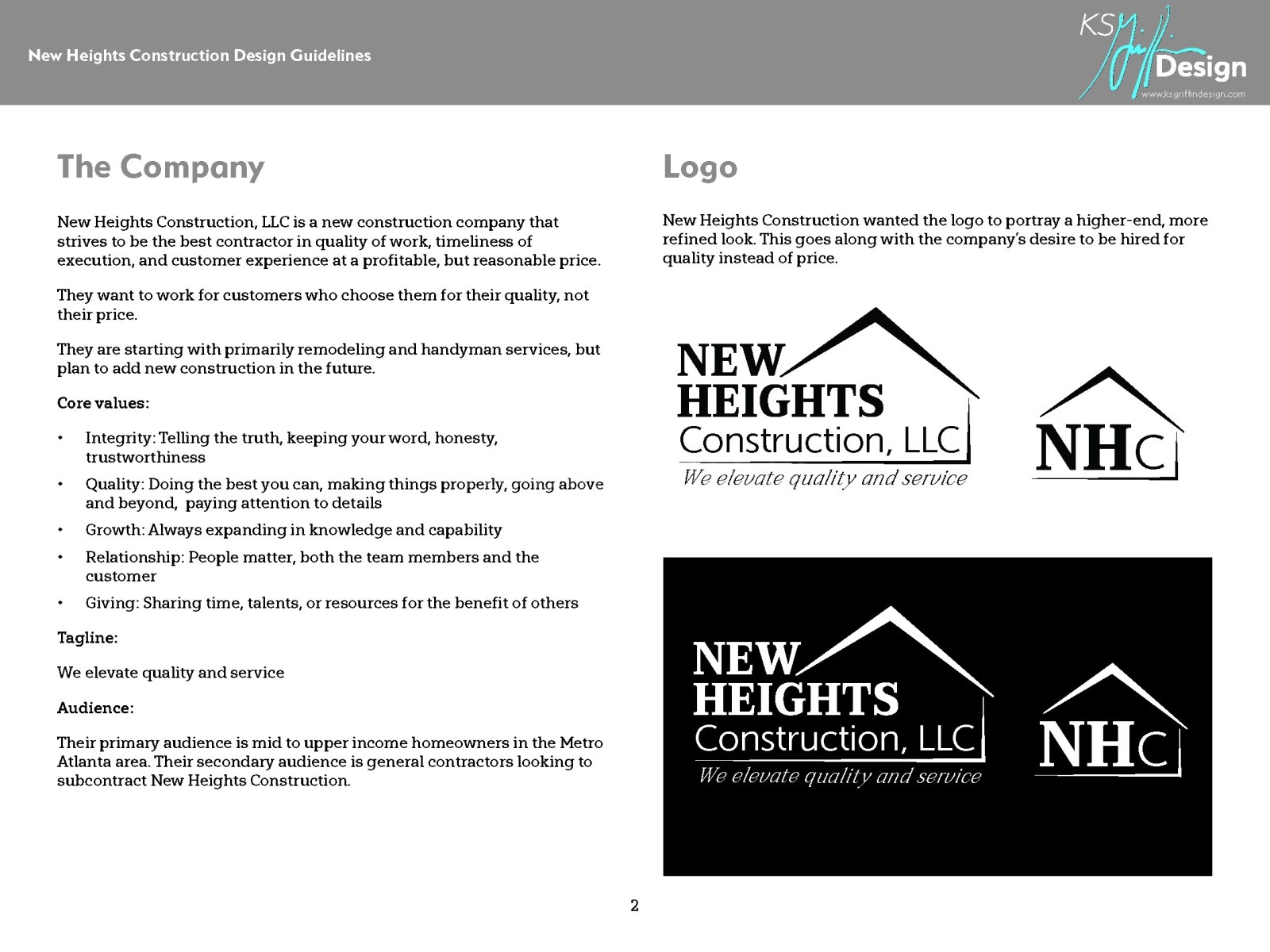
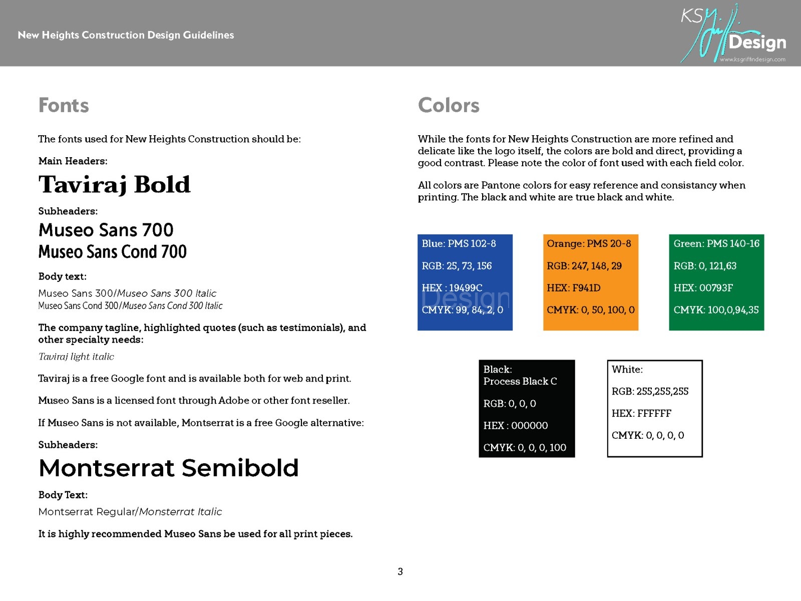
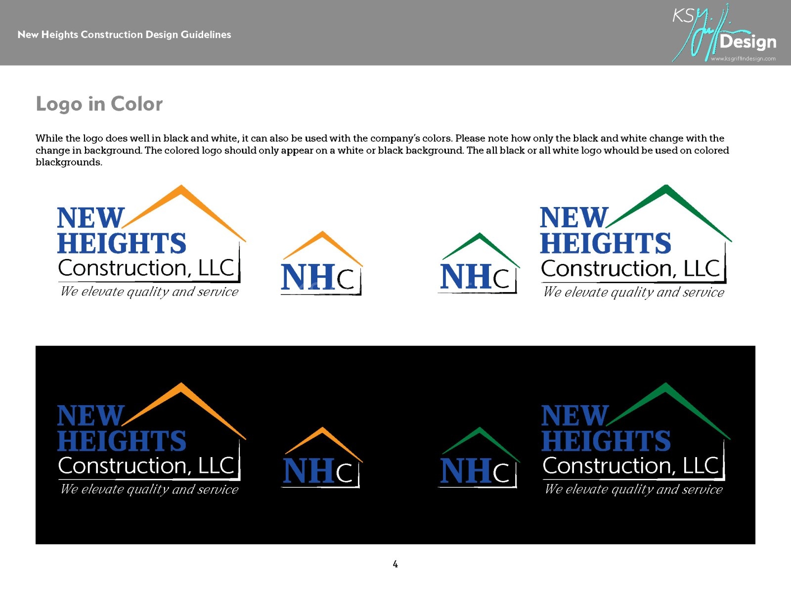
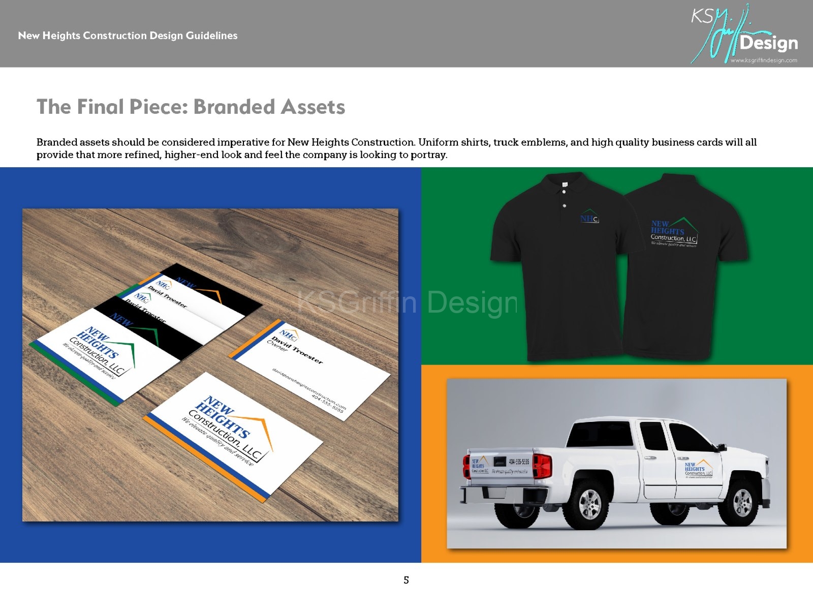
Logo and Branding Guidelines: New Heights Construction
New Heights Construction, LLC approached KSGriffin Design requesting a logo and branding guidelines for the newly formed company. Their target audience is mid to upper income homeowners who are looking for quality workmanship. They wanted a more refined look for the company, which is why we chose a more delicate touch to the logo., but used bolder colors for greater visibility and contrast.
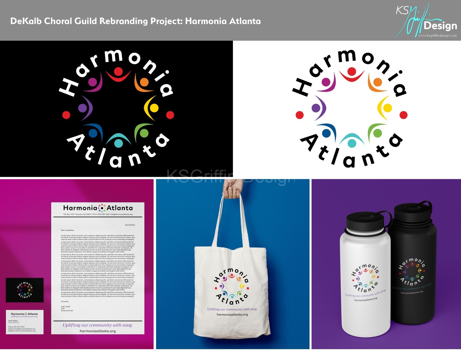
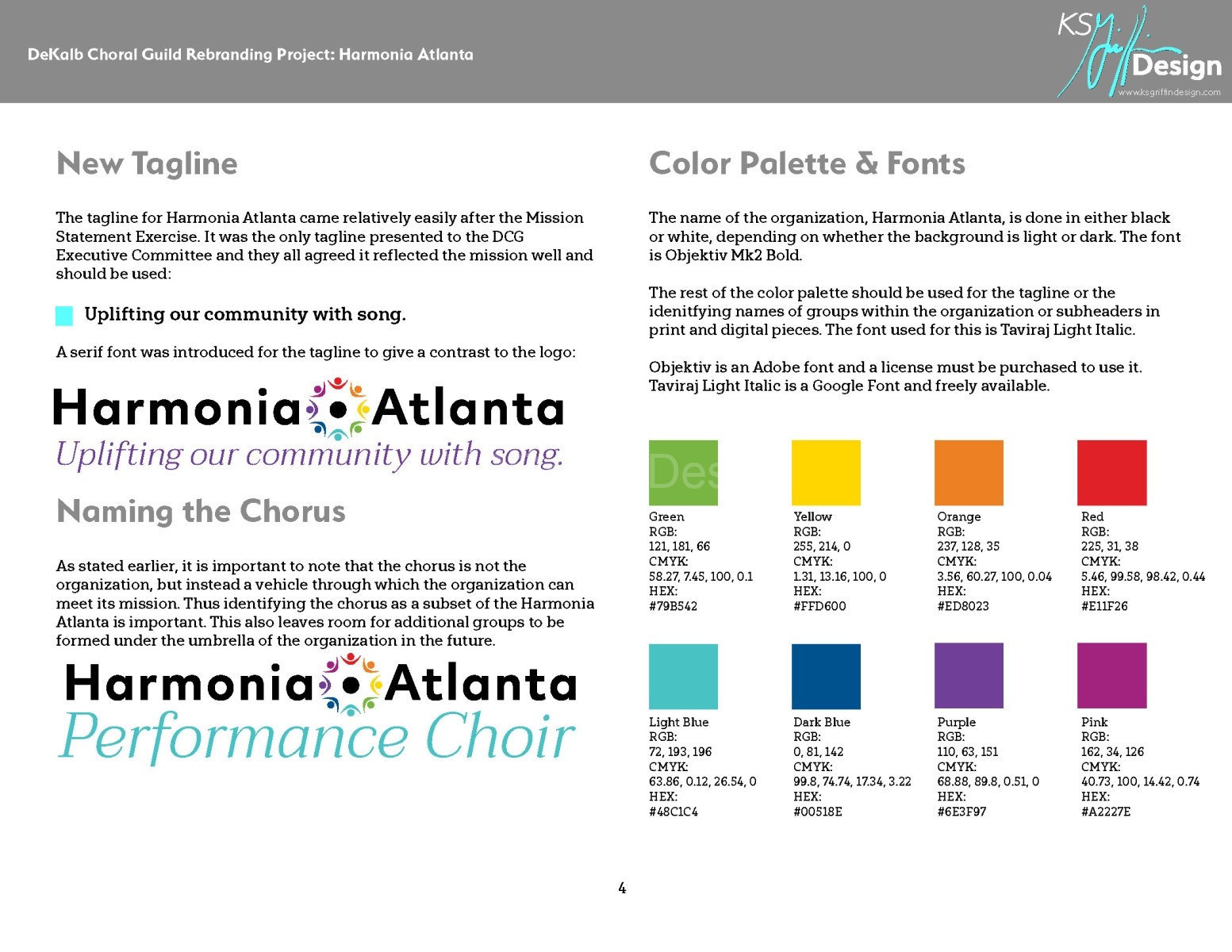
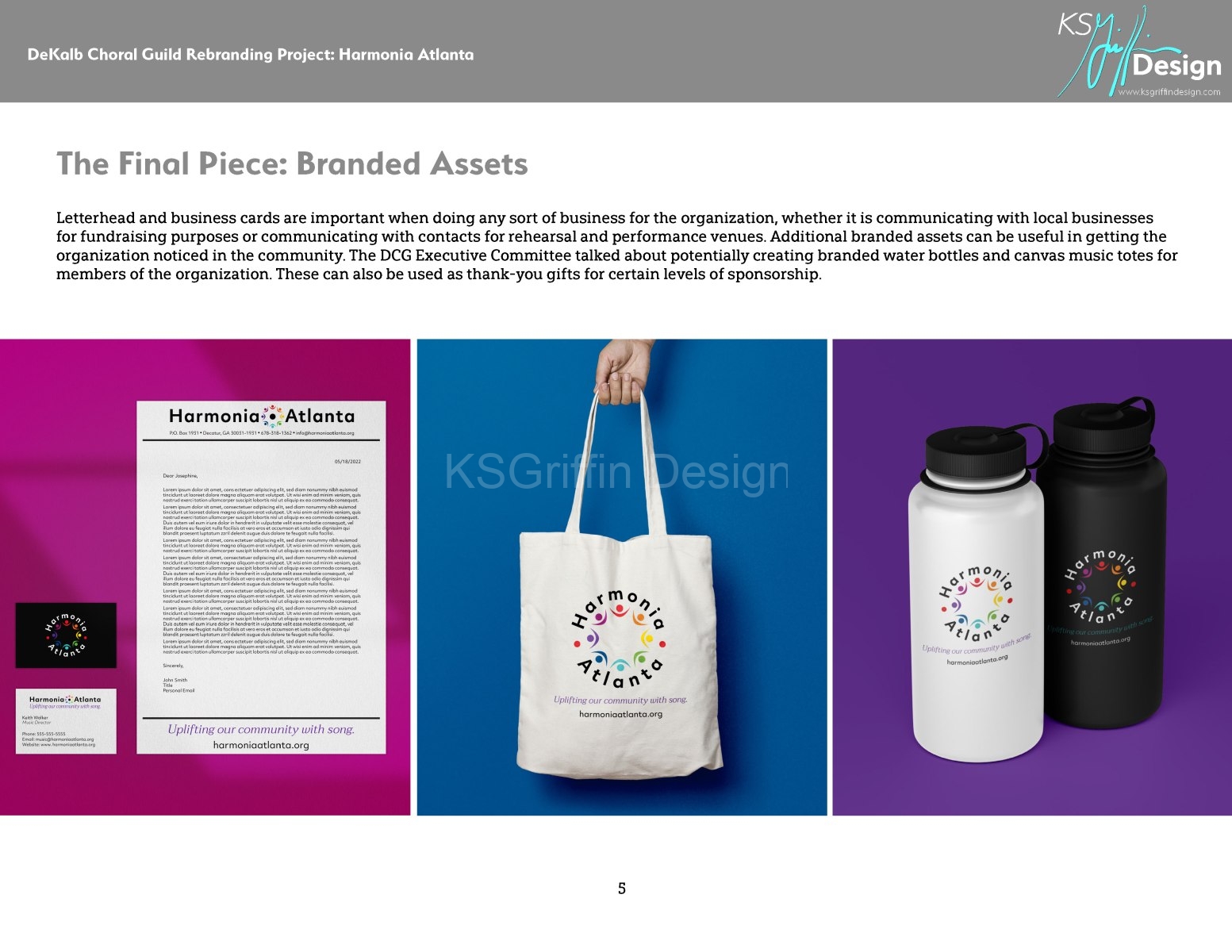
A Complete Rebranding: Harmonia Atlanta
DeKalb Choral Guild was established in 1978. In the last decade, they became an Arts Partner of the Charter for Compassion. This transformed the organization from strictly a performing arts organization to one which intentionally incorporated compassion for their community in everything they did, including dedicating at least one performance a year to a particular social issue or nonprofit organization.
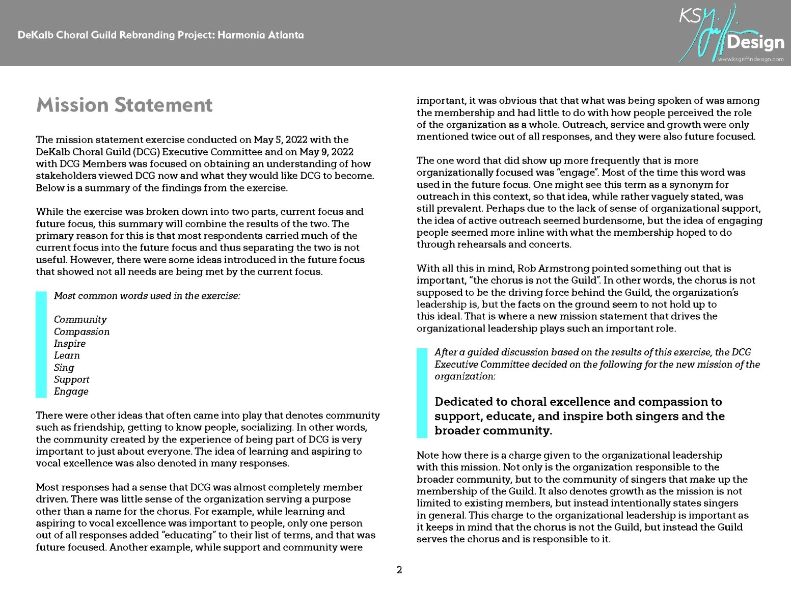
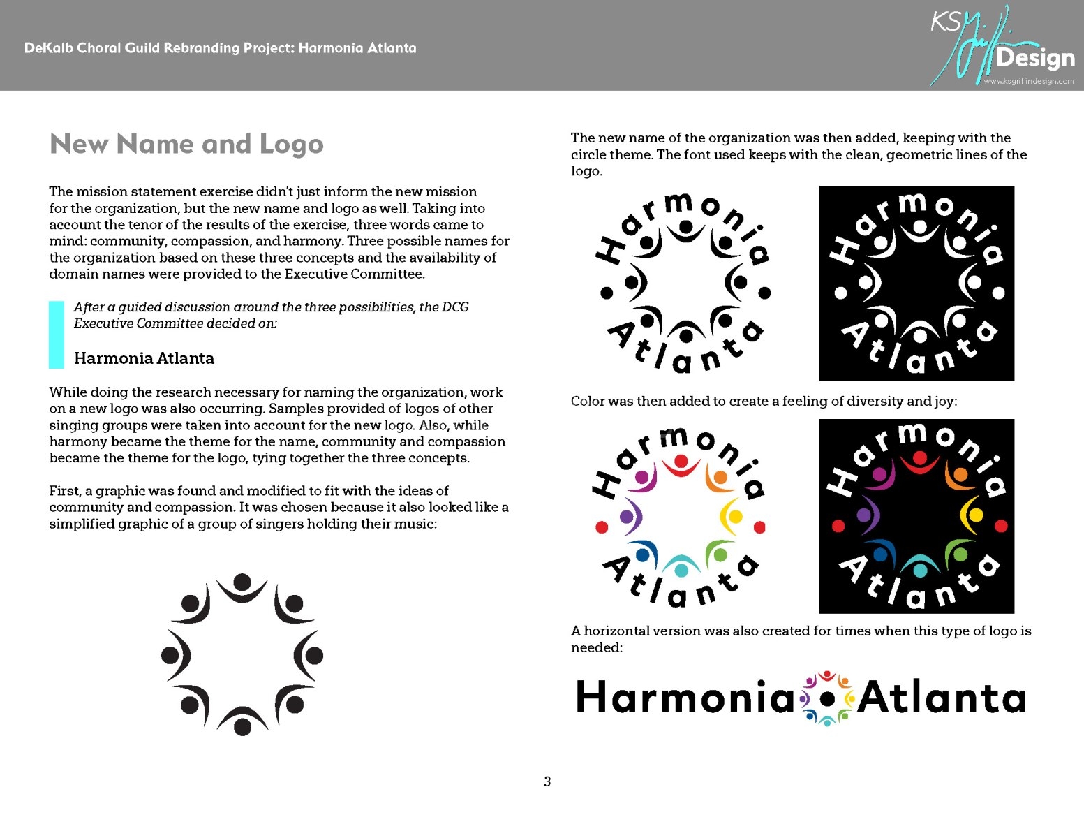
The leadership of the organization determined it was time for a rebranding of DeKalb Choral Guild to better align itself with its partnership to the Charter for Compassion and to embrace the entire Metro Atlanta community, not just DeKalb County. KSGriffin Design was hired in May of 2022 to guide them through the process of creating an updated mission, deciding upon a new name and tagline, and designing a new logo and website.
Below is the rebranding document that resulted from this effort.
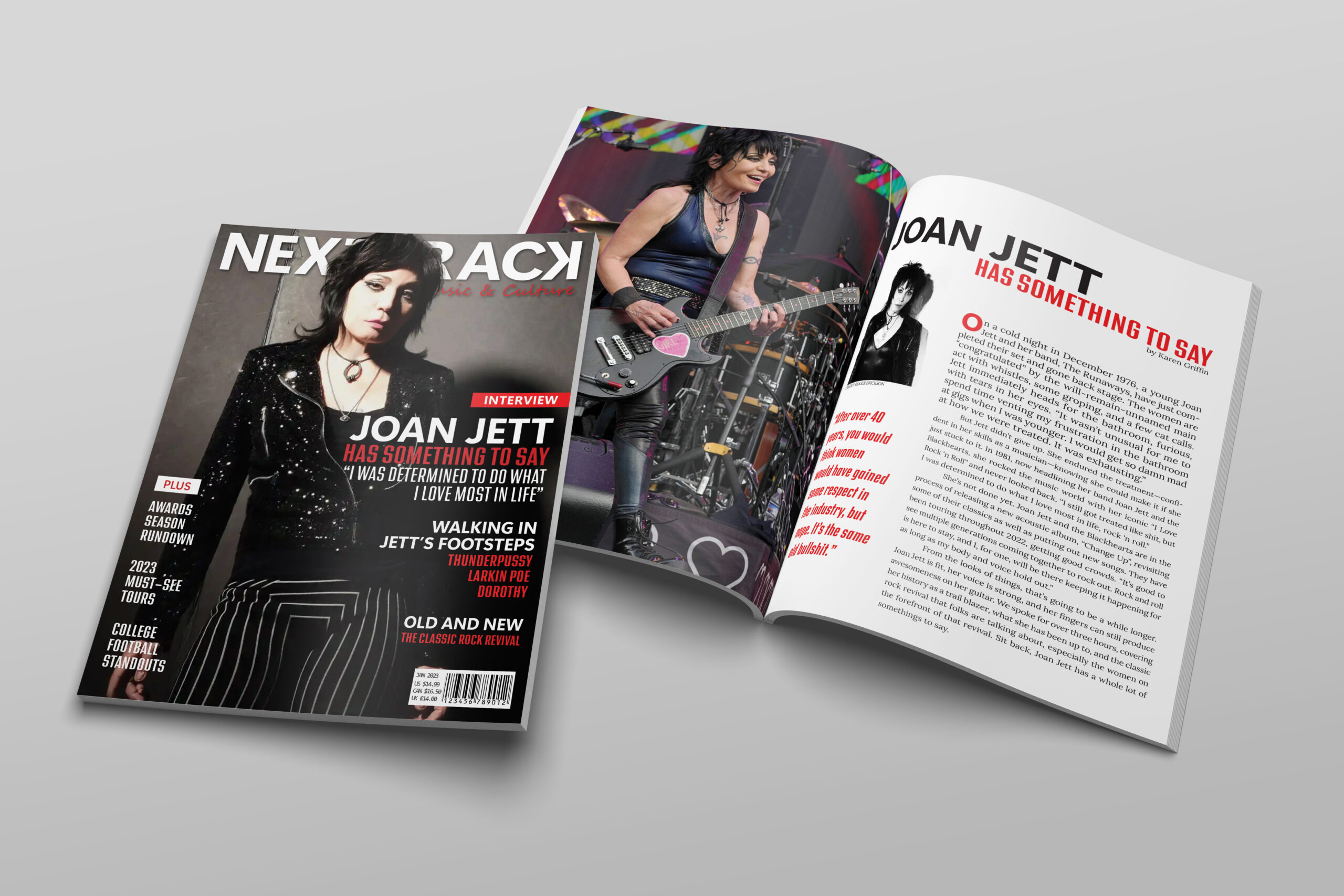
Logo and Editorial Layout: NEXTTRACK Magazine
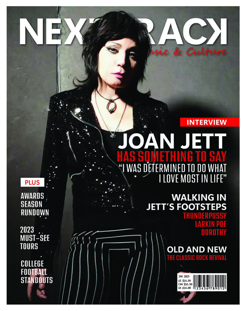
For this Sessions College for Professional Design project, a fabricated US-based publisher wanted to start a new music & culture magazine, using the British magazine MOJO as an inspiration. The audience for this publication was determined to be 35-65 years old and lovers of rock and roll and American sports.
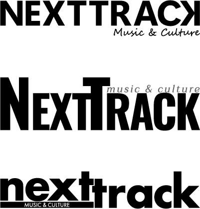
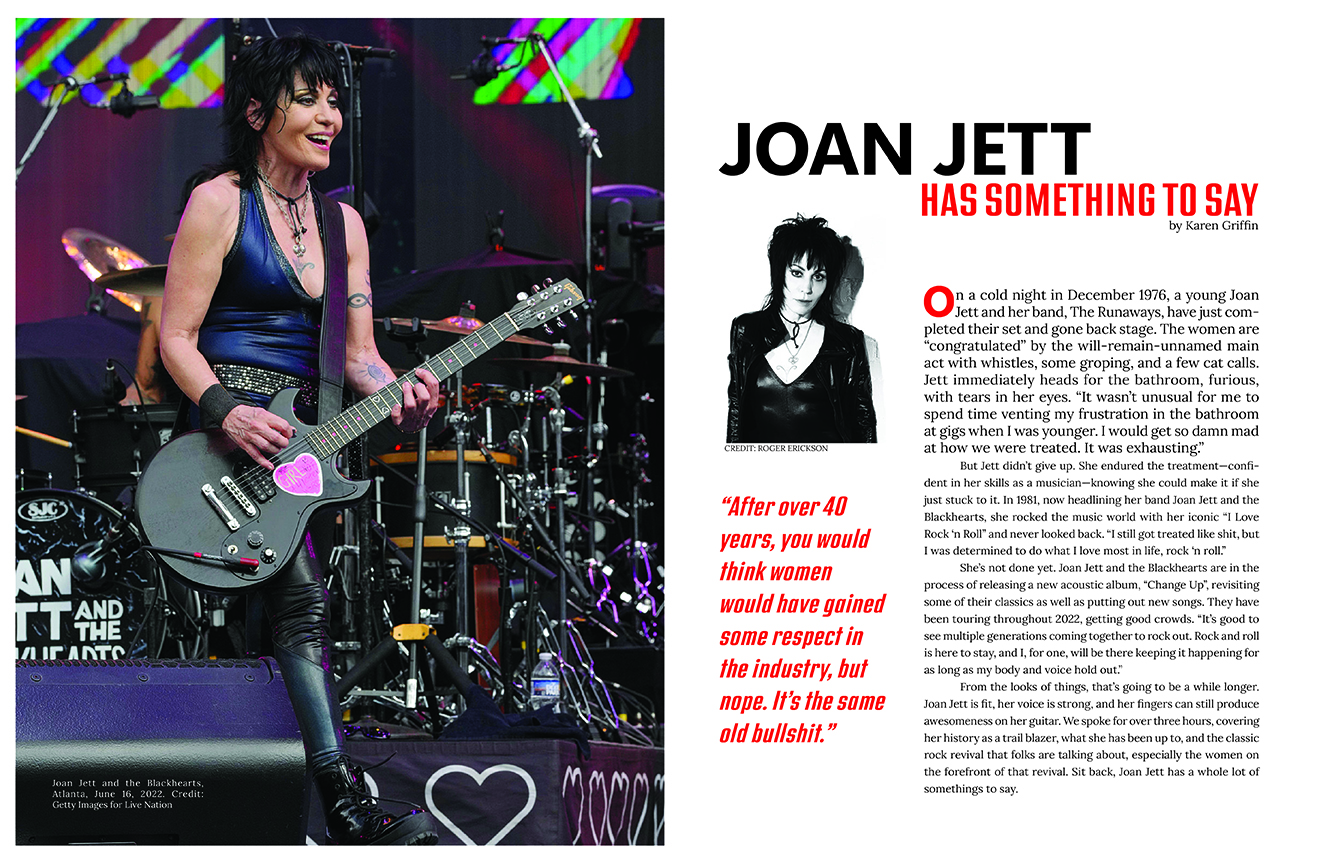
The project included creating the wordmark logo for the magazine and creating a mock-up of a potential cover and article. Extensive research was done on current magazines in this market to come up with appropriate designs for the wordmark and editorial layout. The most important consideration for the wordmark was that it worked both for digital and print publication. The final wordmark chosen was inspired by the symbol used for the function of going to the next track on a CD or digital song list. The subject matter, layout, and color choices for the mock-up editorial layout were chosen to make an impact and promote a more rebellious feel to it.
Logo and Packaging Design: Northern Type Brewery
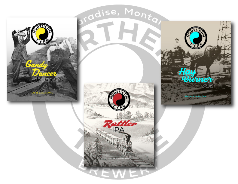
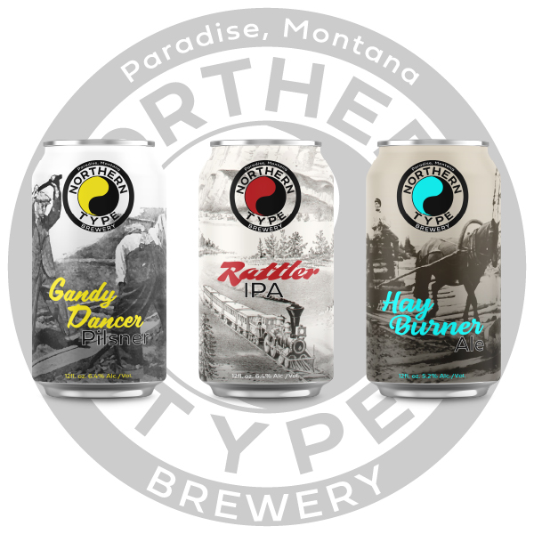
A branding project for Sessions College of Professional Design, this was for a brewery whose identity was inspired by the old railroads that came through Montana, specifically the Northern Pacific Railway. The project entailed creating a logo for the brewery and packaging for the first three beers they were producing, Gandy Dancer Pilsner, Rattler IPA, and Hay Burner Ale.
After researching the now defunct Northern Pacific Railway, I decided to use the railway’s old logo as inspiration for the brewery’s. Not only is it culturally significant, it provides for flexibility in coloration, allowing the use of fun, vibrant colors to catch the eye.
I discovered the names of the beers were all derived from old railway lingo and gathered Creative Common images that exemplified the meanings of the names for the packaging. Using basic black and white imagery allows for the bright colors of the logo and typeface to stand out, providing contrast and a bit of playfulness.
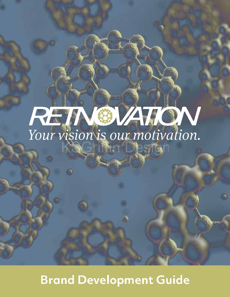
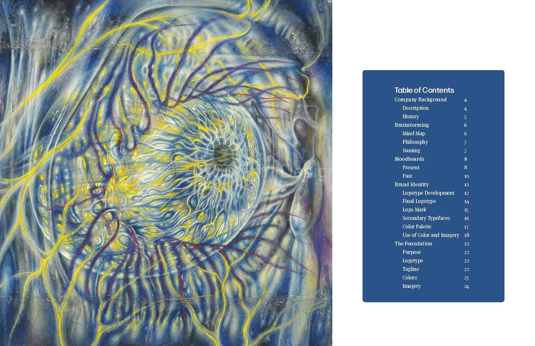
Logo and Brand Development Guide: Retnovation
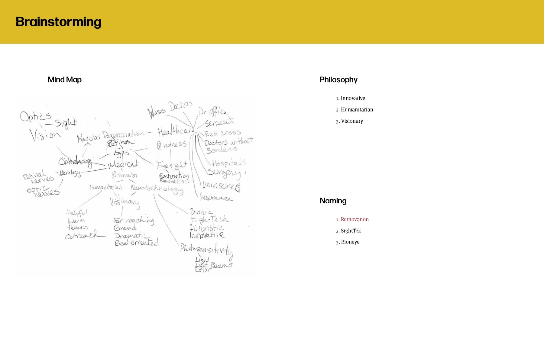
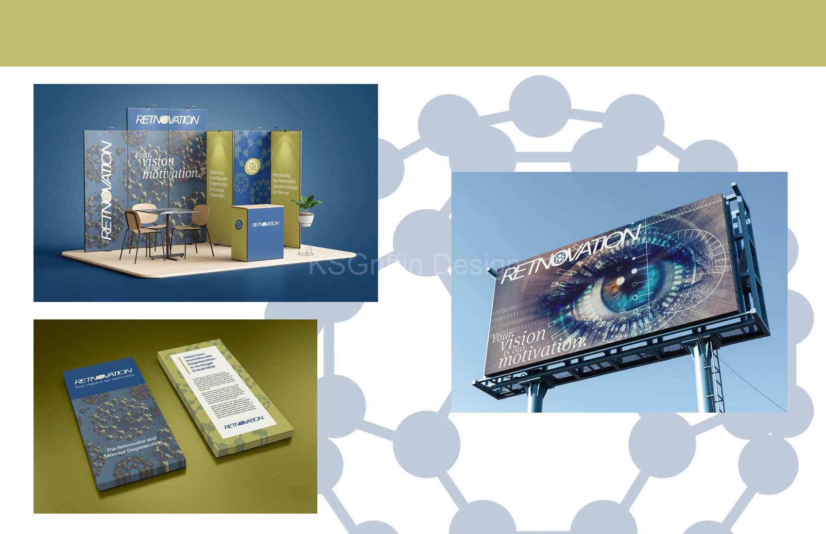
This was the capstone project for California Institute of the Arts’ five course Graphic Design Specialization. The project entailed creating a start-up company and going through the process of creating a complete Brand Development Guide.
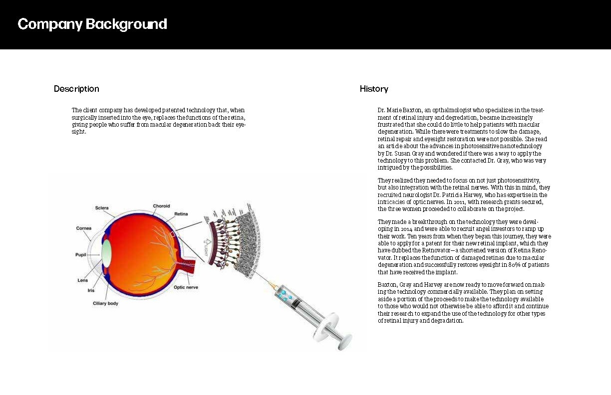
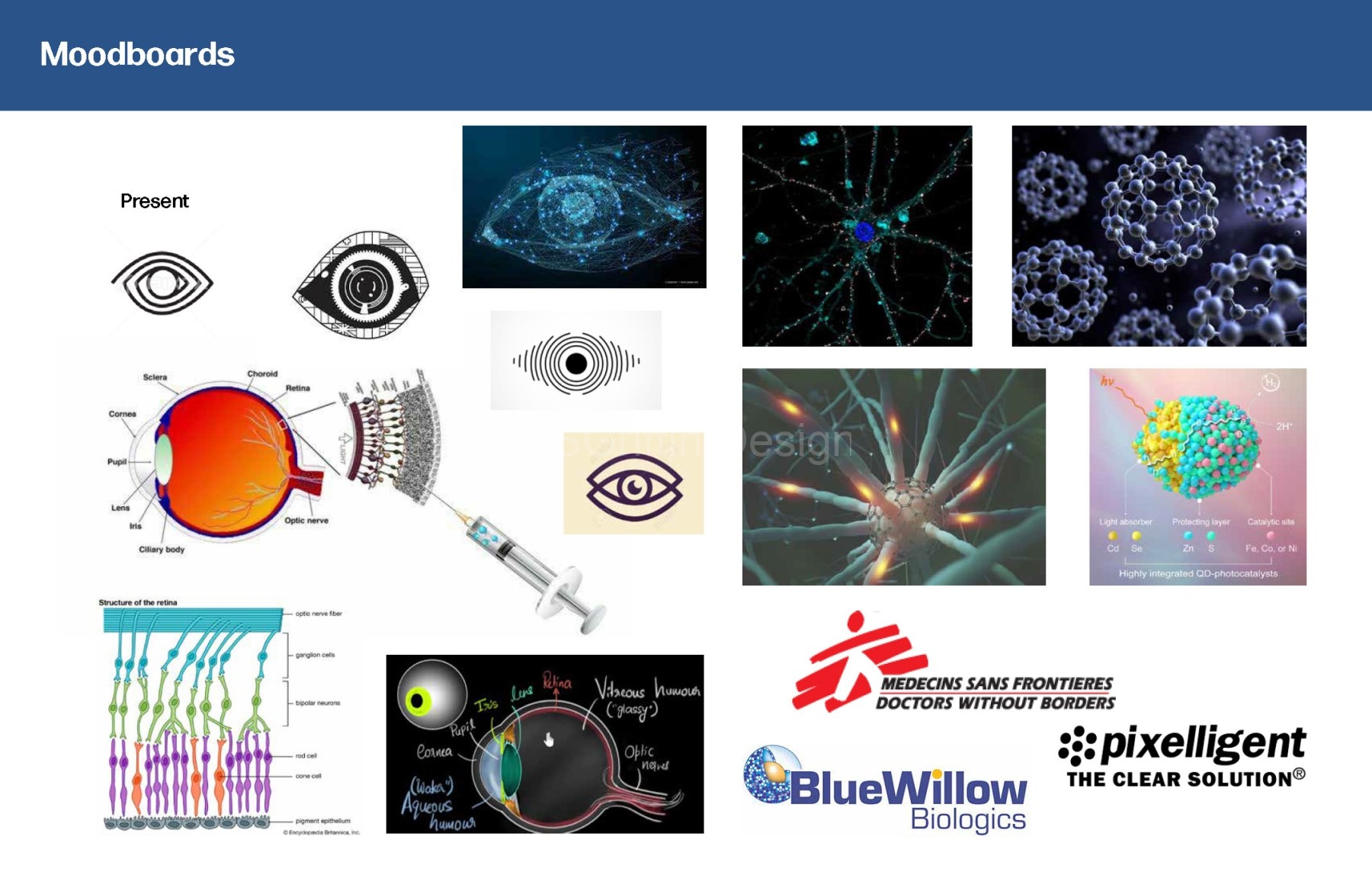
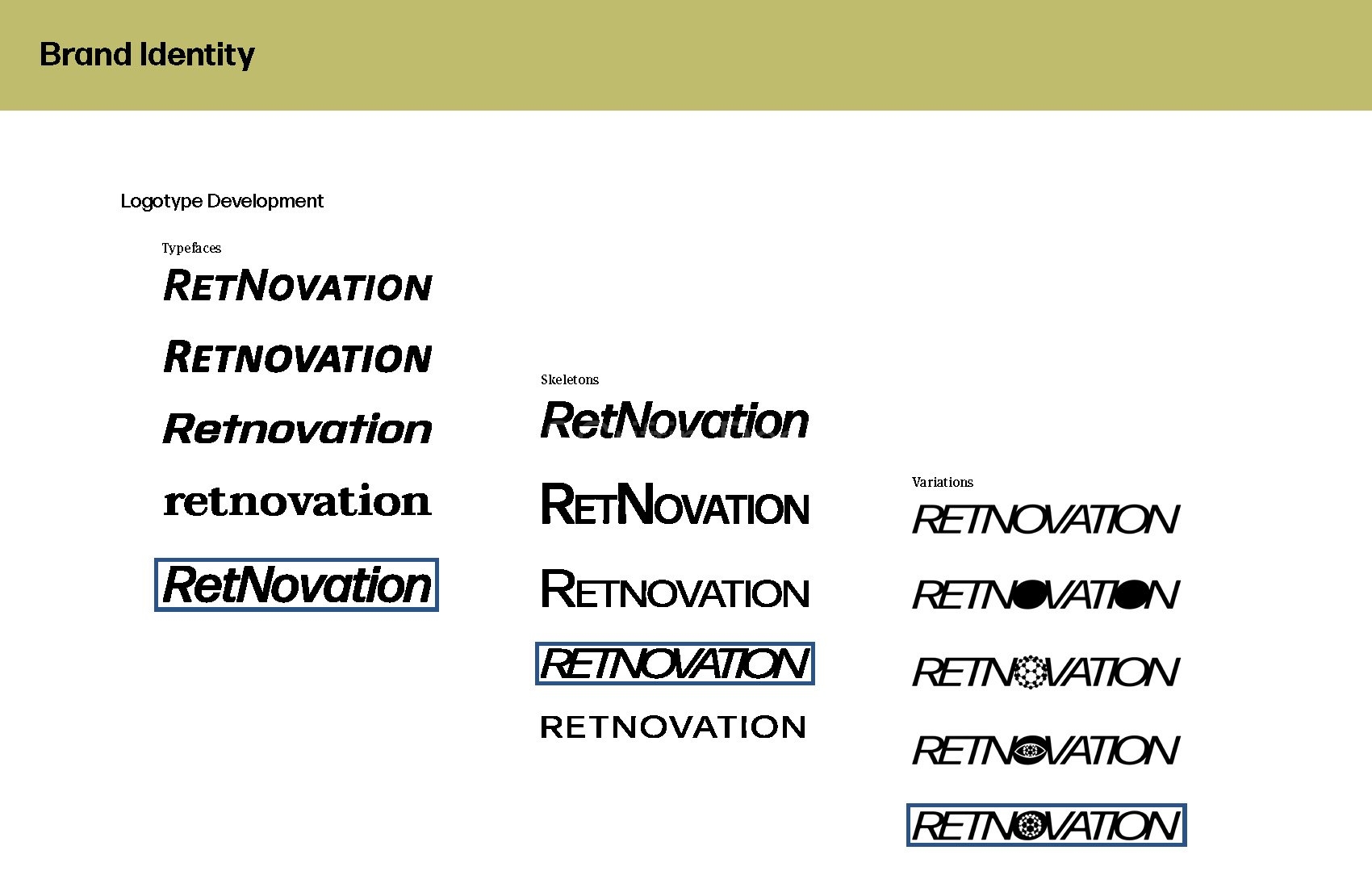
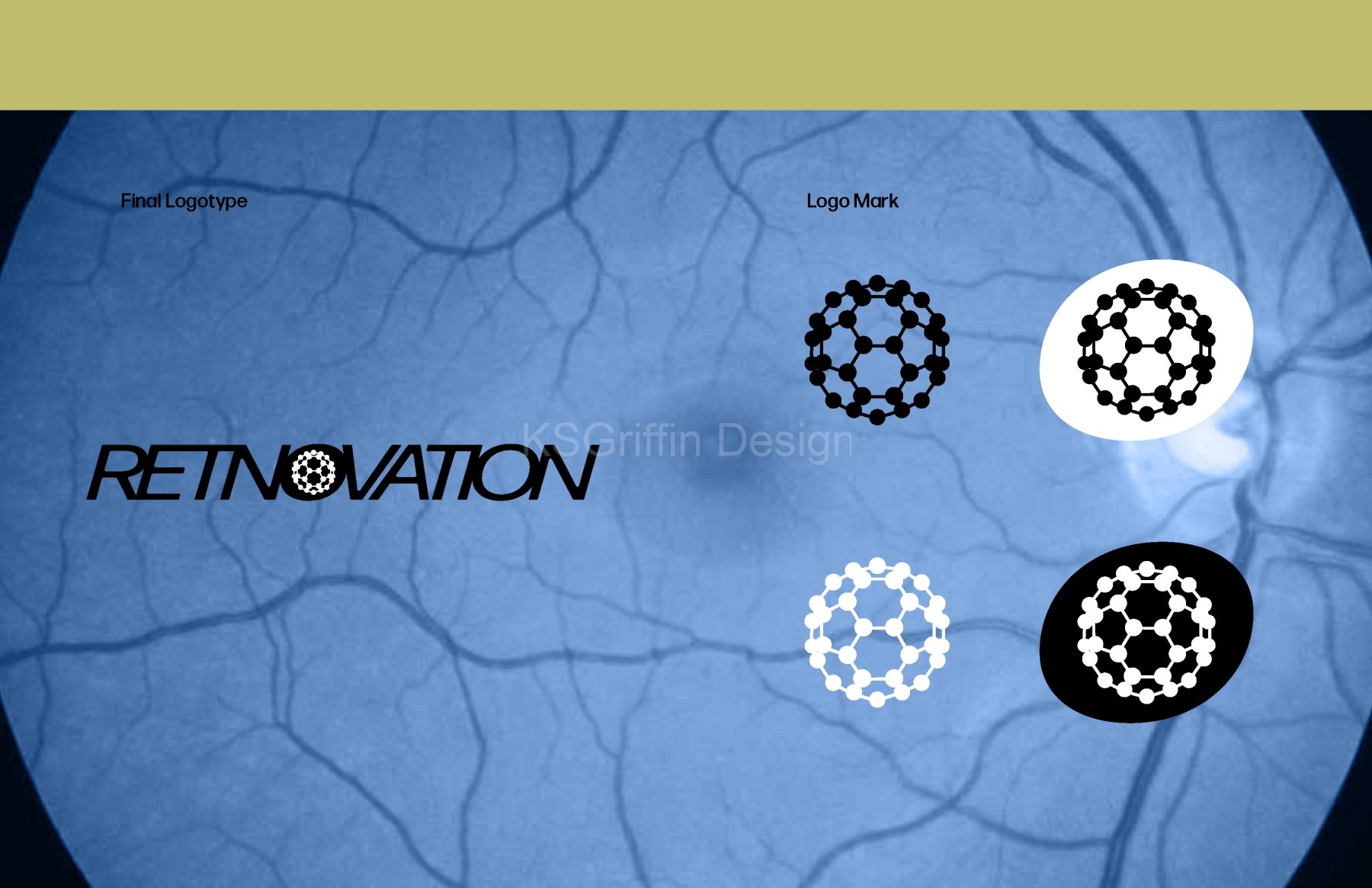
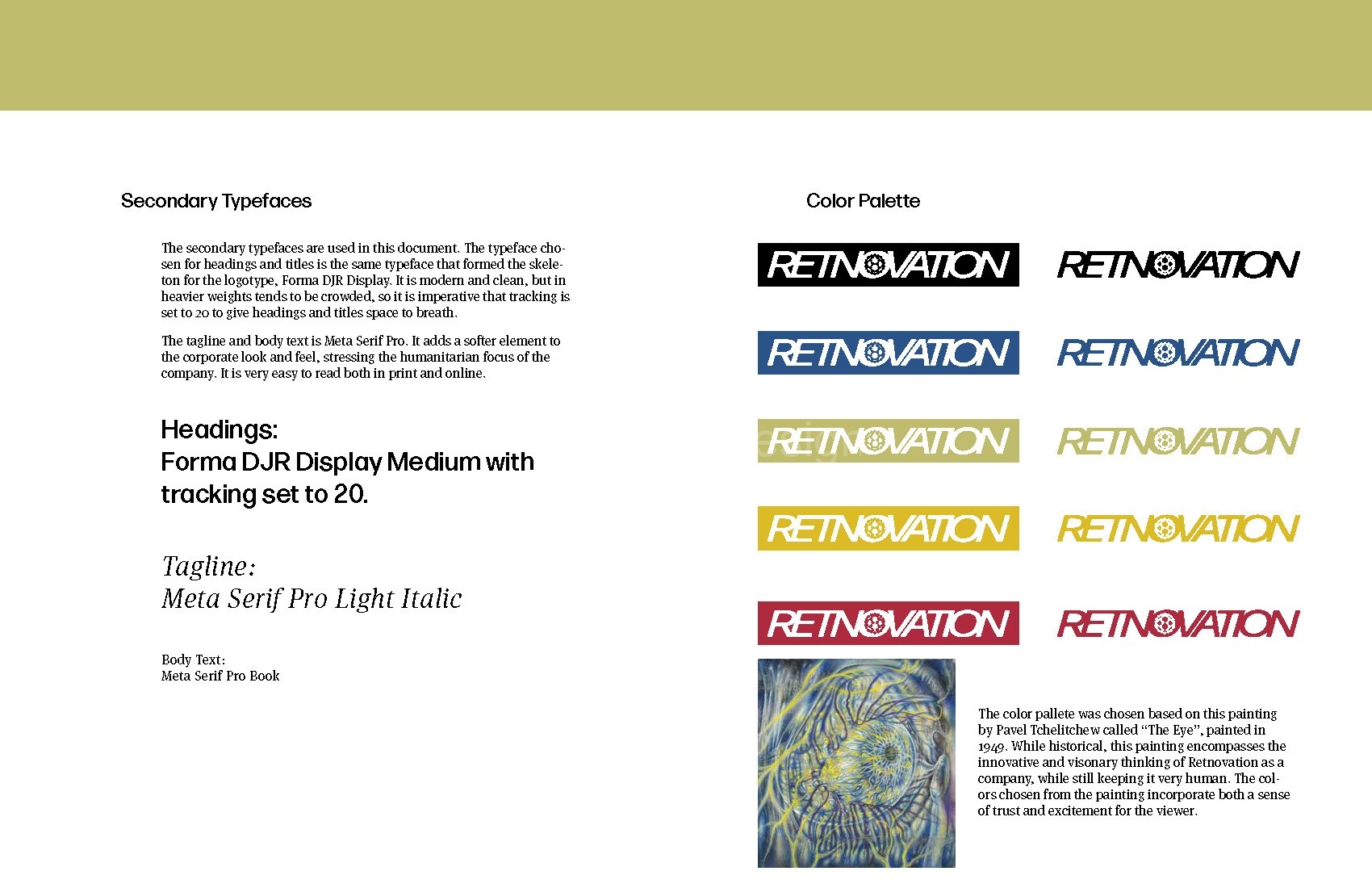
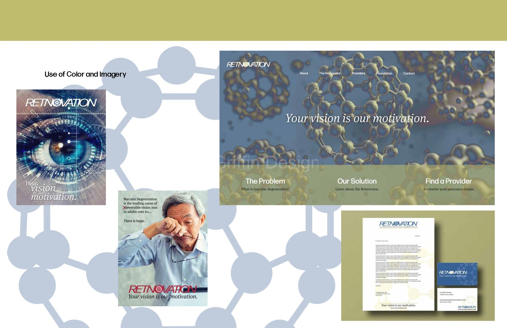
The company I created developed nanotechnology for the eye that reverses the damage of macular degeneration. While this is highly technical, it is also highly personal for those who are suffering from the disease. The logo was designed using imagery that depicts the technical aspects of the company, while the warm color palette was chosen to reflect a personal bond with those suffering from the disease.
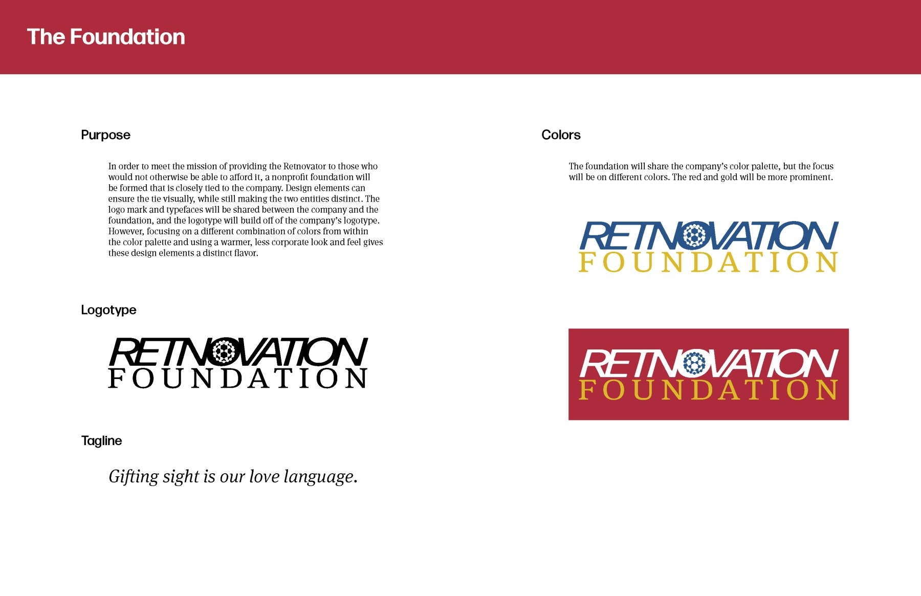
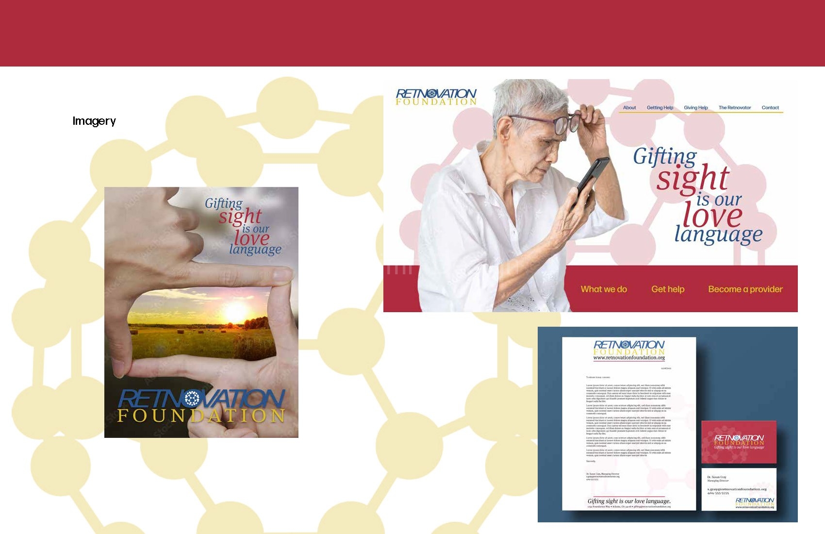
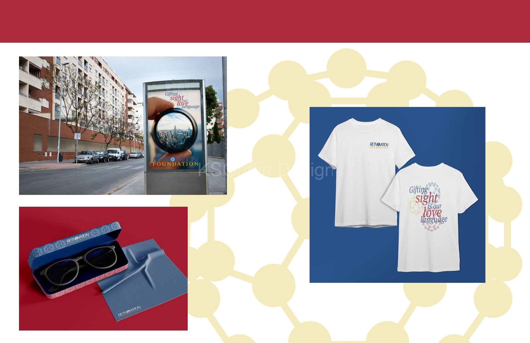
Included in this project is the additional formation of a nonprofit foundation that is attached to the new company. Compatible branding was created for the foundation so that it would be easily recognizable, though it used a different color palette to differentiate it from the company.
The following is the completed brand development guide. You can download the guide here.
